
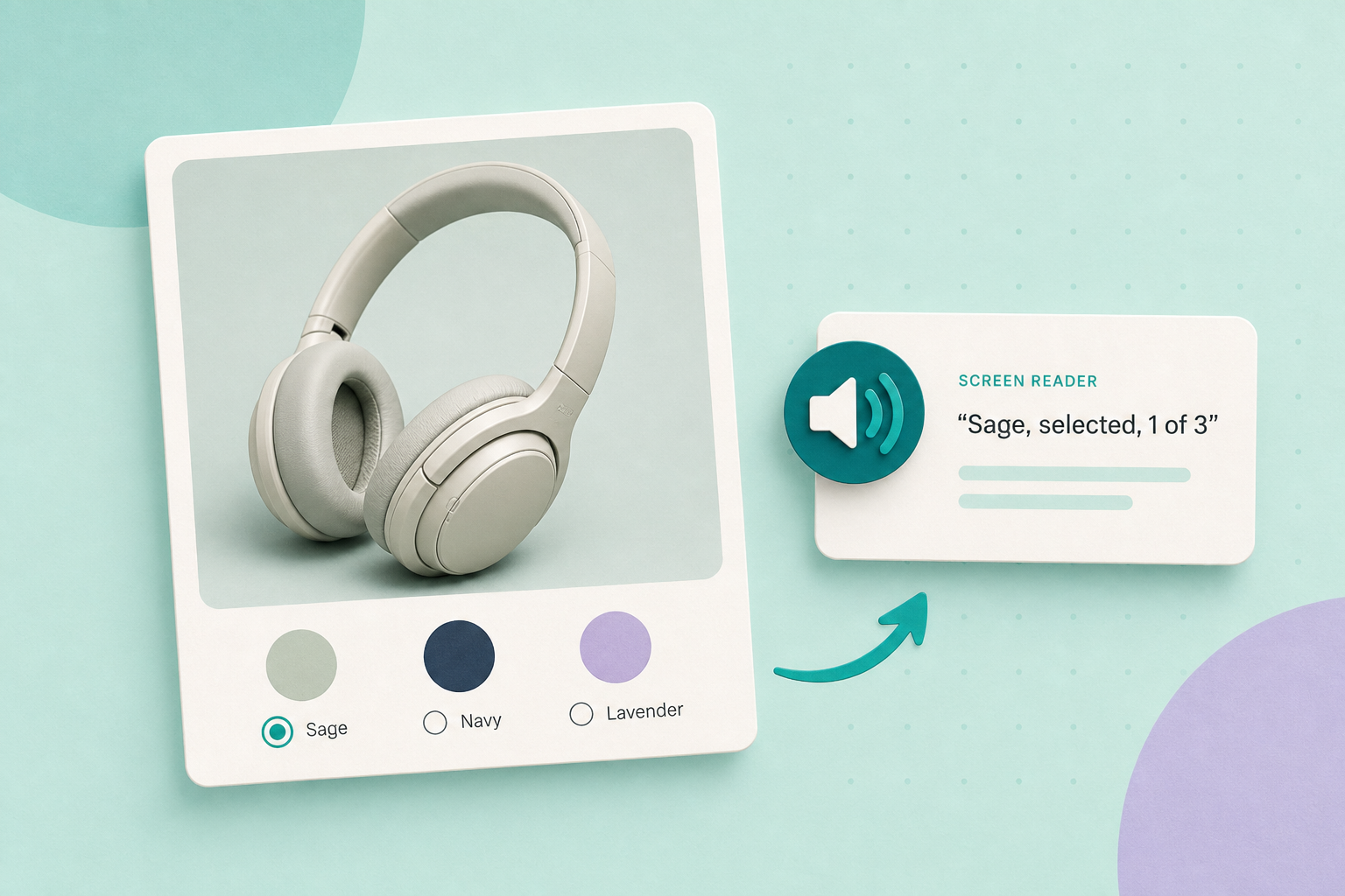
Make the simple choice first: render each colour as a real form control (a radio input) with a visible swatch label, visually hide the label text but not the input, and style the label as the colour square. This preserves native keyboard behaviour, lets screen readers announce the colour name and gives you a programmatic checked state to wire into WooCommerce’s variation logic.
Contents
Why use native radios (short)
Native radio inputs already implement important accessibility behaviour: they are in the Tab order, they expose a programmatic checked state and they respond to Space (with Arrow keys commonly used for moving between items); Enter is only used optionally in some toolbar contexts. Styling the radio’s label as the colour swatch keeps that behaviour while showing a square, round swatch or checkmark—no extra JavaScript required for basic keyboard and screen-reader support.
For guidance on the underlying HTML pattern and labelled controls see the WordPress accessibility recommendations for form controls: WordPress accessibility guide.
How to implement a radio-swatches pattern
Recommended structure:
- One radio input per colour value (name shared across the group).
- A text label that contains the colour name. Hide the text visually but keep it available to assistive tech.
- Style the label (or a pseudo‑element) to show the colour square and an explicit selection indicator (border, checkmark, outline) that doesn’t rely on hue alone.
- Ensure the input’s checked state drives the variation-selection logic in WooCommerce (the attribute value must be submitted or dispatched to whatever JS handles variation selection).
Illustrative HTML (copyable):
<fieldset role="radiogroup" aria-label="Colour">
  <legend class="visually-hidden">Choose a colour</legend>

  <input type="radio" id="colour-red" name="pa_colour" value="red">
  <label for="colour-red">
    <span class="swatch" aria-hidden="true" style="background:#c42d2d"></span>
    <span class="visually-hidden">Red</span>
  </label>

  <input type="radio" id="colour-blue" name="pa_colour" value="blue">
  <label for="colour-blue">
    <span class="swatch" aria-hidden="true" style="background:#2d6fc4"></span>
    <span class="visually-hidden">Blue</span>
  </label>
</fieldset>
Notes on the example above:
- Use the legend and a visible group label so screen-reader users understand the group purpose.
- Keep the colour name in a visible-label element that you only hide visually (not with display:none). That ensures screen readers announce the name. Follow your theme’s recommended .visually-hidden technique from its accessibility guide.
- When a radio is checked, the browser exposes that native state. Your theme/plugin JavaScript should listen for change events on the radios to update selected variation, price and images. See WooCommerce’s variable product documentation for how variations are defined by attributes: WooCommerce variable products.
Custom widgets and ARIA: when you must
If you cannot change the rendered inputs (for example a theme or plugin enforces a div-only structure), implement a proper ARIA radio pattern rather than an inert visual-only control. That means:
- Wrap the group with role=”radiogroup” and give each option role=”radio”.
- Manage aria-checked on each option and keep a single focusable element in the group (or manage tabindex per the ARIA example).
- Implement the WAI‑ARIA keyboard model: Arrow keys move focus and selection, and Space activates the focused option; Enter is optional in certain toolbar contexts. Follow the ARIA Authoring Practices keyboard guidance for radios: WAI-ARIA radio example and the authoring practices overview: ARIA Authoring Practices.
Important limit: ARIA roles and scripting are error‑prone. If you can change markup, prefer real inputs. If you must script an ARIA widget, copy the interaction model precisely and test with screen readers.
Visual and contrast rules to check
Color alone must never be the only cue for selection. Provide a clear non-colour indicator: a visible border, a checkmark, size change or an inner icon. Those indicators and any overlaid text must meet the WCAG non-text-contrast requirement (3:1) for UI components and focus/selection indicators. Read the WCAG explanation here: Understanding WCAG non-text-contrast (1.4.11).
Control approaches — quick comparison
Native radios styled as swatches
Pros: preserve native keyboard behaviour, focus outlines and the browser-provided checked state; easier to test and maintain and integrates cleanly with variation-selection logic. Cons: you may need to change a theme or plugin template where markup is fixed.
Custom elements with role=”radio”
Pros: allow visual flexibility when you cannot change output HTML. Cons: require precise scripting (managing aria-checked, tabindex and the ARIA keyboard model) and more extensive testing with assistive technology. If you must use this approach, follow the WAI‑ARIA radio example and authoring practices: WAI-ARIA radio example.
Testing checklist you can run now
- Keyboard-only test: Tab to the swatch group. Use Tab/Shift+Tab to enter and leave, and use Space to select; if your widget also implements Arrow-key navigation, confirm arrows move the active option and that Space selects. Watch focus outlines—are they visible?
- Screen-reader check: With NVDA, VoiceOver or JAWS, navigate to the swatch group. Confirm each option announces the colour name and whether it is selected (checked or not). If the group uses ARIA, confirm aria-checked is correct after selection.
- Non-colour cues: Turn your page to greyscale or use a colour-blindness simulator to confirm selection is still obvious. The labelled text name must also be available to assistive tech.
- Contrast check: Verify any selection indicator (border, checkmark, icon) meets the WCAG 3:1 non-text-contrast requirement. See the explained criterion: WCAG non-text-contrast.
- WooCommerce wiring: After selecting a swatch, confirm the product page updates (variation availability, selected price, SKU, images). If it does not, inspect or ask the theme/plugin docs for how it listens for attribute changes and connect your inputs to that event.
Fictional example (labelled)
Fictional example: A small clothing shop replaced an image-only swatch widget with hidden radio inputs labelled “Red”, “Blue” and “Green”, and styled each label as a swatch with a visible white checkmark for the selected state. After the change, keyboard users could Tab to the group and use Space to select a colour; screen-reader users heard “Blue, radio button, selected” when a colour was chosen. (This is a fictional illustration based on the documented patterns above.)
Finish by choosing which route fits your site: change the theme/plugin template to output radios (preferred) or implement a precise ARIA radio widget only where changing output is impossible. Then run the testing checklist above until all items pass.
Related practical guides you can read next: Make product variation controls accessible: keyboard & screen‑reader checks and Make variation options easier to choose.